Less is More: Tips for Communicating Family Planning Data Online
Webinar Recap
Most of our information gathering happens online. Family planning (FP) and reproductive health (RH) programs usually have access to large amounts of data, which can be time-consuming and difficult to sift through. So how might we best share data online, in ways audiences can absorb and understand?
On May 10, 2022, Knowledge SUCCESS hosted a webinar to review common behaviors we see among web users and why they matter for communicating about data. In the webinar, we shared a case study of a recent Knowledge SUCCESS activity (“Connecting the Dots“) that included a lot of data about the impacts of COVID-19 on FP use and programs. Taking you through our process, we highlighted key lessons that you can apply to your own data. Finally, we offered a practical skill shot session on how to share data online in interactive ways that are easy to understand and digest.

Knowledge SUCCESS Presenters:
- Anne Kott, Senior Program Officer at the Johns Hopkins Center for Communication Programs
- Catherine Packer, Senior Research Associate at FHI 360
- Sophie Weiner, Program Officer at the Johns Hopkins Center for Communication Programs
Part 1: Online Behaviors and Why They Matter
Three things to remember about Internet users
Ms. Kott shared three things to keep in mind when sharing information online.
First, Internet users are foragers. Most people go to Google first—and this is true in any part of the world. They type in a search term, go to a webpage, get what they need, and come back to Google. The theory to describe this is information foraging. Information foraging explains why people don’t scroll mindlessly or click on every single link: because they attempt to maximize their rate of gain and get as much relevant information in as little time as possible.
Second, online content has become really comprehensive. News articles now come with supplemental content like videos or photo galleries, and there has been an explosion of interactive content. In their everyday lives, people are looking at highly engaging, thorough content, and they bring those expectations with them to work. When those expectations aren’t met, they are more likely to leave a webpage quickly, without fully processing its information.
Third, when you’re designing content online, it’s vital to think about people as people, not as their title or profession. It’s very natural, especially when communicating something technical like family planning data, to think of our peers in their professional capacity. That thinking brings some assumptions along with it—that we can use highly technical language, that we can present a lot of information and they will be able to process it, and that they want all that information. But that’s not the case. People working in FP/RH are bombarded with information every day, and we’re exhausted from pandemic-related burdens in our work and personal lives. These factors have a real impact on how much we’re able to do and focus on in a workday. And you absolutely need to account for that as you share information online.
How people read online
Ms. Kott shared several statistics about how people process information online. First, they don’t read thoroughly. 80% of web users scan content. Less than 20% read word for word. Second, they don’t scroll that far. Think about what you see on your computer screen right now. Everything in that box is a screenful of content. If you scroll down, you’ll see another screenful of content. Eyetracking data show that 75% of viewing time is spent in the first two screenfuls of scrolling. Finally, people value easy reading. Text that is concise, scannable, and objective gets more than twice as much reader engagement. Ms. Kott emphasized that these insights apply equally to our FP/RH community as to the general public, despite how technically focused we are.
Designing for accessibility
When we talk about creating an accessible web experience, we typically mean improving usability for people who may have vision or hearing impairments, motor impairments that impact their ability to use a mouse, or a cognitive condition that causes an inability to focus on large amounts of information.
Visual hierarchy is an important component of accessibility. Having a clear visual hierarchy on the page helps users more easily understand how to navigate it. Visual cues are the elements that subtly draw attention to areas of importance and help users interact with the site. Think of an arrow directing you to scroll down the page, or a plus sign that indicates you can expand a block to see more content.
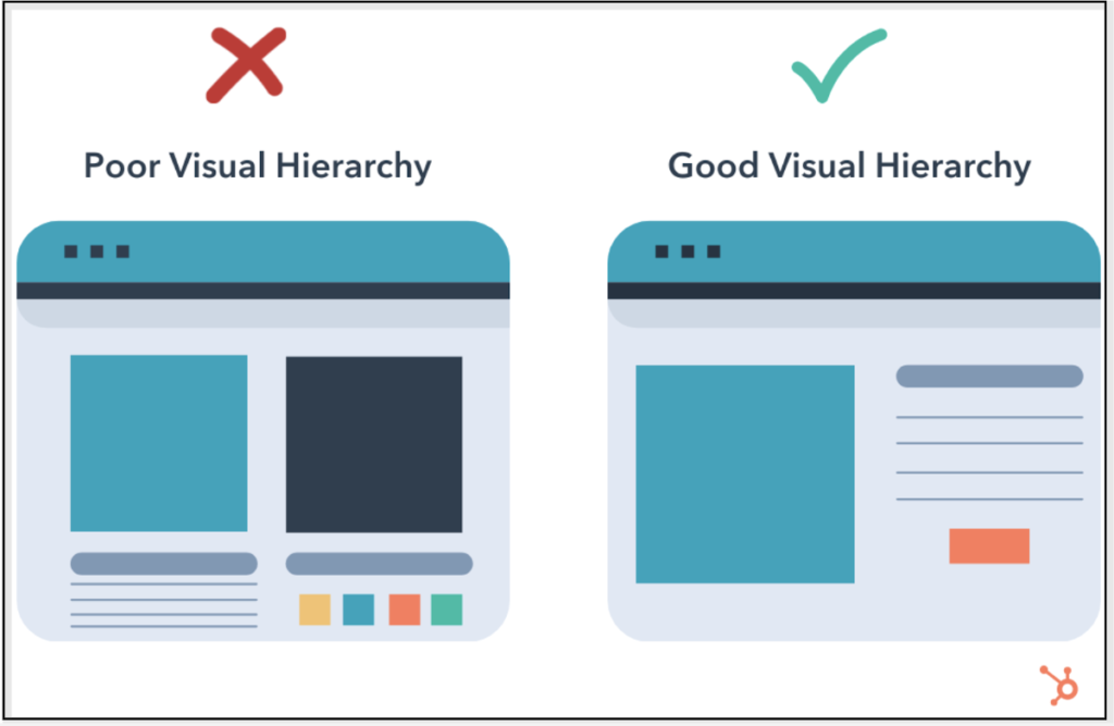
Things like color contrast, line height and spacing, and not including substantive text in an image file (because a screen reader is unable to pick up that text) are all factors that make it easier for many people living with disabilities to scan a page.
Finally, Internet speed affects how quickly computers can download information. When you add animation or interaction to a webpage, it adds more elements for someone’s computer to download, so you want to find the right balance.
Part 2: Case Study of “Connecting the Dots”
Background on Connecting the Dots
Ms. Packer introduced Connecting the Dots, an interactive website feature exploring the impact of COVID-19 on FP in Africa and Asia, launched by Knowledge SUCCESS in January 2022. The goal was to document the impacts of COVID-19 on FP users and programs in a way that is accessible and engaging for program managers and technical advisors. Knowing that people are very busy, the team created Connecting the Dots to distill a large amount of information into something easy to understand and offering different levels of detail, depending on what users were looking for, all in one place.
Connecting the Dots sought to answer the following questions:
- Did pregnancy intentions or contraceptive use change due to COVID-19?
- Were women able to access family planning services during the pandemic?
- How did family planning programs respond?
- What lessons can be applied to future pandemics or crisis situations?
Process for creating Connecting the Dots: from analysis to design
Ms. Packer discussed the process for selecting the data, indicators, and program experiences to highlight in Connecting the Dots. Initially, compiling information and conducting data analysis resulted in a 30-page text document. Ms. Packer walked through each main section of Connecting the Dots to show before-and-after images of how the information was condensed and translated into an online format.
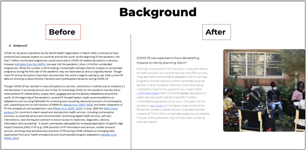
She highlighted interactive charts using Performance Monitoring for Action (PMA) survey data for four key FP indicators overlaid on country-specific COVID-19 contextual information. She discussed the process for selecting successful program adaptations and how to handle the collected information, which resulted in three downloadable case studies:
- A radio campaign in Côte d’Ivoire implemented by Breakthrough ACTION and West Africa Breakthrough ACTION (WABA)
- Remote supervision for self-injection of DMPA-SC in Madagascar with the Madagascar Ministry of Health and the DMPA-SC Access Collaborative, implemented by PATH and JSI
- Efforts to resume family planning service provision in Nepal with the Family Planning Association of Nepal (FPAN)
Acknowledging that some people just want the highlights, the Key Implications section was designed to be a standalone synthesis of the most relevant findings, with questions and short, direct responses. Since we know that other people want more information, additional resources include a downloadable PMA data worksheet, an FP insight Connecting the Dots collection, and webinar recordings.
Accessibility and analytics
Ms. Kott discussed how Knowledge SUCCESS took accessibility into account when designing Connecting the Dots, referring back to concepts from her first section including clear page hierarchy, consistent design clues (such as a plus sign consistently meaning click-to-expand), color contrast, line height and spacing, and page load time.
Many people think that once a product is published, it’s done. However, monitoring is important for informing improvements. Ms. Kott discussed the analytics that we collected for Connecting the Dots, and some design changes made in response to these analytics to help increase user engagement.
Final reflections
Ms. Packer shared some final reflections for others considering sharing data online:
- Developing interactive web experiences is time-intensive, from compiling, analyzing, and writing the copy, to finalizing the layout and design and launching the site.
- You need less than you think. This is the hardest part, especially when you are connected to the data or want to show the big picture.
- Other knowledge management solutions, such as FP insight or a webinar, can be useful for sharing “overflow” information.
- It’s important to determine the best way to visualize the data completely and accurately, without overwhelming the viewer.
- Including a standalone highlights section allows users with limited time to review all the main points.
- Using analytics and making changes to a product can support greater engagement.
Part 3: Skill Shot: Developing Visual Content to Share Data Online
In this section of the webinar, Sophie Weiner offered concrete tips for developing effective online visual content. Three of the most common reasons to create visual content are to build awareness about an issue or organization, to connect people to information, and to encourage them to take action. It’s important to be clear and practical in what you are asking users to do with the information in your digital content.
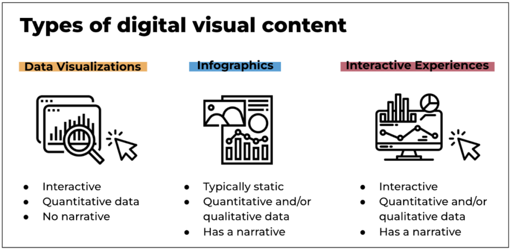
Types of digital visual content
Data visualizations, infographics, and interactive web experiences are three different tools for sharing data online in a visually engaging digital format. Understanding the strengths of each format will help you choose the right approach for your audience.
Steps to developing digital visual content
1. Strategize: Use a content brief to identify strategic elements, such as the “Who, What, Why.”
- WHO is the audience of this piece?
- WHAT are your key messages?
- WHY are you creating this piece?
2. Conceptualize: Gather information for your content and think about how to present it.
- What kind of piece is this?
- What’s the best way to present this information?
- What kind of additional research needs to be done?
- What visuals will best complement the data/information?
3. Create: Write the copy and lay out the design.
Tips and tricks
The following tips for creating visual content to share data online are backed by behavioral economics principles:
- Choose the right tone and style. Audiences are most likely to interact with information that is most relevant and clearly valuable to them.
- Use clear, noticeable headings and subheadings to break up content, label sections, and keep the content short and sweet to reduce cognitive overload. We also suggest using the methods of decluttering and focusing to help your audience more easily process the data and information.
- Use a visual hierarchy to place the most important information up front. Visual hierarchy in web design creates a structure that facilitates understanding and guides the user. According to the primacy bias principle, we are most likely to remember information that is presented first.
- Employ formatting techniques like bulleted lists and bold text to allow the eye (or a screenreader) to focus on the most important information. When confronted with too many choices, users experience “choice overload” and may put off making a choice altogether—like the choice to engage with your content.
- Point readers towards interactive elements by providing directional text or arrows so that they understand how to engage with your content. This eliminates the problem of “hassle factors”—in this case, the hassle of figuring something out on their own.
- Provide a clear call to action. Make sure that your call to action uses active language, is visually clear, and is easy to find. Use design elements to make it stand out, perhaps by adding contrast and white space.
Interested in further reading about the behavioral underpinnings of knowledge management and knowledge exchange? Try these posts:


